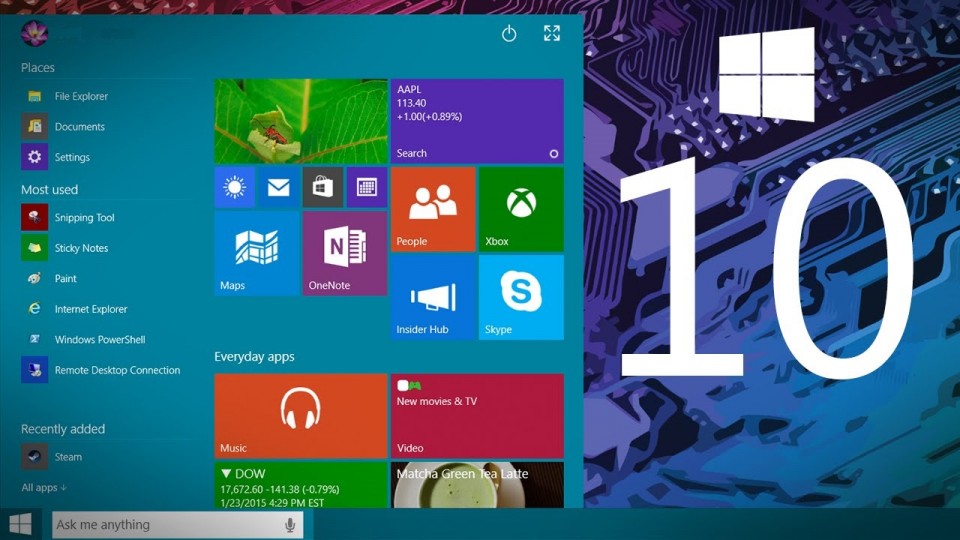
We present to you the list of existing components that are getting modified in Windows 10.
Notifications in Action Centre
Till the previous versions of Windows, the Notifications system has been a minimalistic asset as the only type of notification users ever got was in the form of a small bubble popping out from the bottom right side of the taskbar. That too, contained the information of only currently happening activities of the computer and was not designed to handle more advanced notifications.
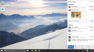
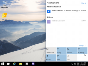
Windows 10 is going to change the concept of notifications forever and for good, as it will bring along a fully loaded Action Centre for system notifications. With the new version of Windows, users will be able to view system as well individual applications’ notifications, plus they will be able to determine which applications or programs they want to be notified about and will also have the ability to review the notifications later on. Let’s shed some light on this feature a little more, unlike before, now users themselves will be able to configure the applications from which they want to receive the notifications which will be displayed in the notification dialog named ‘Action Centre’.
Originally this feature was introduced as a part of Windows phone 8.1 before it paved its way to computers via Windows 10. With the Action Centre being introduced in the computers, users will be notified without any delays for various applications and system activities, such as new Emails, Facebook posts, Skype messages, tweets, calendar events, installed program notification and much more.
As per the current design in Windows 10 Technical Preview build, Action Centre can be opened by clicking the icon resembling a “chat or mail” sign shown in the task bar and for touch screen monitors, it can be swiped in from the right side of the screen.
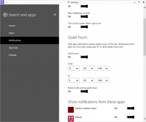
Apart from enabling or disabling system or application notifications, users will be given the control to display notifications on lock screen, add sound to new notifications, and define the quiet hours (during which the notifications will be turned off).
Recycle Bin will be more accessible
Although there has been no enhancement in the functionality of Recycle Bin in Windows 10, but it has become movable in the new version. While working on multiple windows, one might get confused and delete an important file by mistake; in such a situation it becomes very annoying to go all the way down to desktop to open the Recyle Bin and restore the deleted file. In other words, till now the location of Recyle Bin was not really accessible.
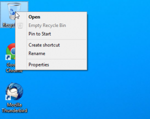
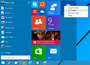
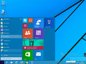
Thankfully, this is going to change with Windows 10, since now Recycle Bin can be kept in the task bar, adjacent to your favourite programs and the Start button. Actually, in order to pin it to the task bar, you will first have to add it to the Start Menu; that is how it is designed in the Technical Preview build which most probably will not be the case with the polished and final Windows 10 version (which might allow you to directly pin it to the task bar). Nonetheless, in the preview build version, first the desktop Recycle Bin icon has to be right-clicked, and then “Pin to Start” option has to be selected.
Once it has been added to the Start Menu, from there again on right-clicking it, the option “Pin to Taskbar” has to be selected which will finally pin Recycle Bin to the taskbar. This modification is surely going to help every Windows user if a crisis like mentioned before occurs at some point of time.
Alterations in Windows Explorer
In the previous Windows versions, in order to reach to your frequently-used or favorite files/folders, you had to go through the same monotonous task of opening the File Explorer and tracking down the documents scattered over different drives and locations.
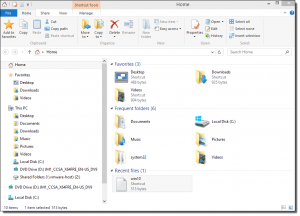
With so many changes and newbies coming to Windows 10, Microsoft might have thought that this was the right time to make some minor yet useful changes in the File Explorer, which is introduction of a ‘Home’ folder. In the next-gen OS, launching a File Explorer window will directly open up Home folder which will contain all your File Explorer’s Favorite folders, Frequently used folders, and Recently accessed folders.
This change will result in easier and faster accessibility to your favorite and most frequently used folders, although it would be even better if in the future (in the final product), the users are given the controls to manage the preferable view of the File Explorer like whether to display Home folder or not ? Which folders to display – Favorite or Frequently used? and so on. Giving the users the right to alter File Explorer view will only help in their privacy issues as then they will be able to decide what to hide or show from other users of the same computer.
The good old ‘This PC’ menu remains untouched, so you can still look out for your documents in the traditional way, if you are not using the Home folder.
Another modification that has been done in the File Explorer is the addition of ‘Share’ button in its taskbar.
Start Menu
The story of Start button’s modification journey is quite interesting – till Windows 7 there was everybody’s favorite Start button residing on the desktop’s taskbar for years until things completely changed with Windows 8 which ditched the Start button completely and surprised (rather shocked!) its users with an unintuitive and non-familiar Modern UI Start Screen. However, things got better with Windows 8.1 where Microsoft took a U-turn and brought back the Start button to the desktop, which further launched the Start screen (a blend of both Windows 8 start menu and its predecessors); plus users were given the control to either boot the system directly to the desktop or simply launch Start screen, whichever option they felt comfortable with.
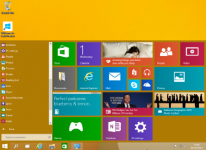
Microsoft has ultimately figured out the best way to integrate our beloved Start menu with their new invention of Windows-8 style Live tiles for various apps in Windows 10. In the new version, the Start Menu will be present at the same place as we all have been used to since ages. This button will open up a renovated Start Menu in which all the frequently and recently used applications will be shown on the left side and to its right side live tiles for various apps will be shown. The power button has also been relocated and moved to the upper right side of the Start menu panel.
Furthermore, it will be possible for you to manage and configure the Start Menu the way you like it, for instance, you will be able to remove the live-tiles functionality from Start menu altogether, resize the Metro apps, and even resize the entire Start menu to full screen or make it shorter/taller.
Command Prompt is finally getting upgraded
Windows 10 is going to bring the basic functionalities to Command Prompt that have been missing from it since its birth. For no explainable reason, Command Prompt had been devoid of some basic features like copying or pasting text to/from it, text selection, window resize and a few more. Microsoft has eventually listened to the users complaining about its disabilities and is rectifying them in Windows 10. So from the new version onwards, users will be able to copy or paste the text just like they perform these operations in any other text editor(s), plus they will be able to select the text line-wise, starting and finishing the selection from the point they desire (which means block selection of text has been done away with).
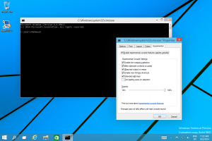
Moreover, word wrap will be proper according to the adjustments made in console window’s size, for instance, if the window size is decreased then the text at the end of line will be wrapped and moved to the next line unlike its current version where scrolling (left/right) has to be done to view the hidden text. Not only this, but the console window’s size will also be highly adjustable and there won’t be any need to pre-define the buffer size of window.
This change in the Command Prompt is definitely going to be accepted and loved by every user who has ever used this program at any point of time.
